Lecture 10
High quality graphs using Gnuplot
Gnuplot
Gnuplot is a free and open-source commandline driven plotting utility. You can plot high-quality graphs using raw data files or Excel-like program outputs.
Before starting this tutorial, make Lecture10 folder, go to that folder and download the data from here. Right click and click save as. Name it as population.txt in ~/Lecture10.
Type gnuplot on a terminal window to start Gnuplot.
Plot
The first file we plot is population.txt. Run the following command after running Gnuplot on your terminal.
gnuplot> plot 'population.txt'
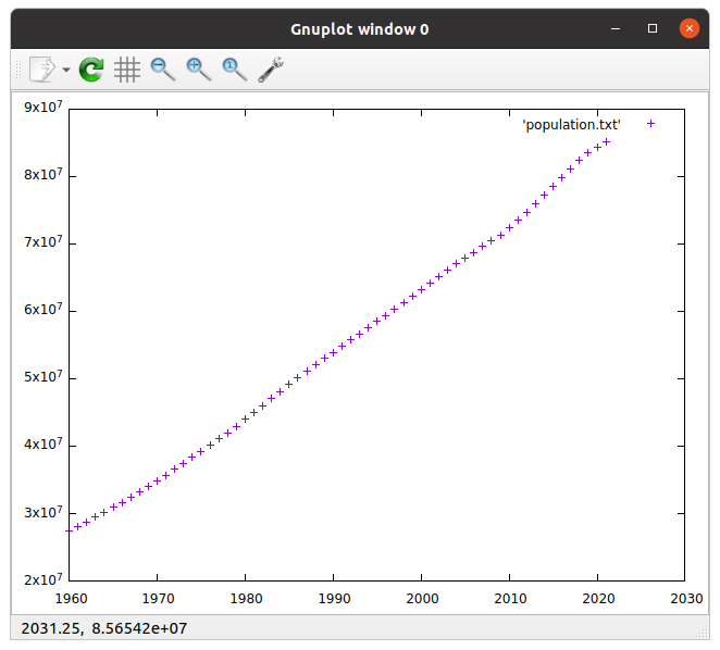
Here, Gnuplot reads population.txt which contains a five-column list. The first column, as default in Gnuplot, is read as the x-axis values of our plot while the second column is y-axis.
We will change the columns later, but you can specify them by us 1:2.
gnuplot> plot 'population.txt' using 1:2
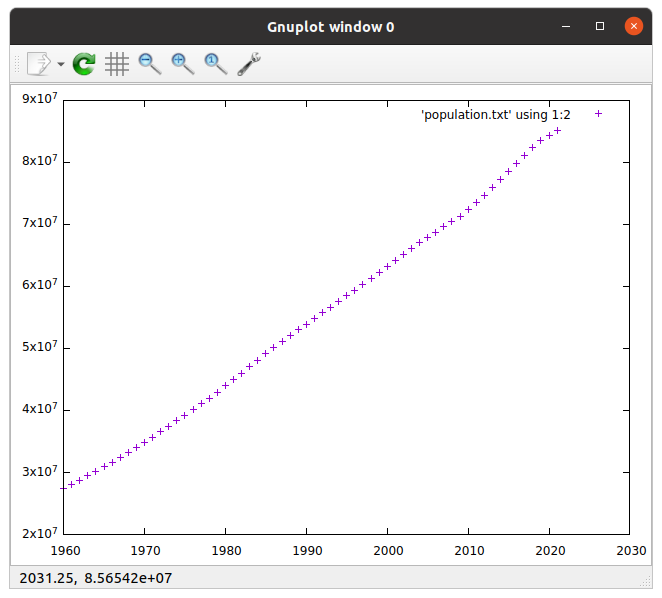
Legend (title)
We can change the legend which seems 'population.txt' us 1:2 on the right-top corner of our graph currently.
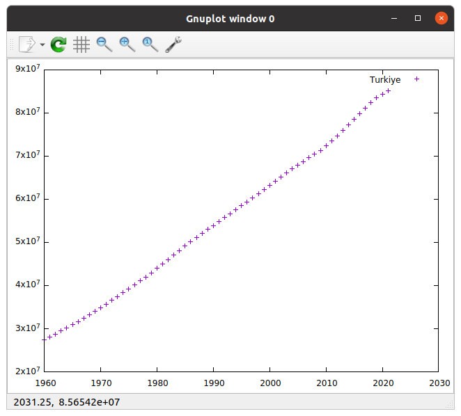
To do this we should use title option in Gnuplot as follows:
gnuplot> plot 'population.txt' using 1:2 title 'Turkiye'
All the options in Gnuplot have their short names to save from the typing time. We can get the same result when we run,
gnuplot> p 'population.txt' us 1:2 t 'Turkiye'
Shape and color options
This + sign can be changed with another sign. To check the available signs in Gnuplot we run
gnuplot> test
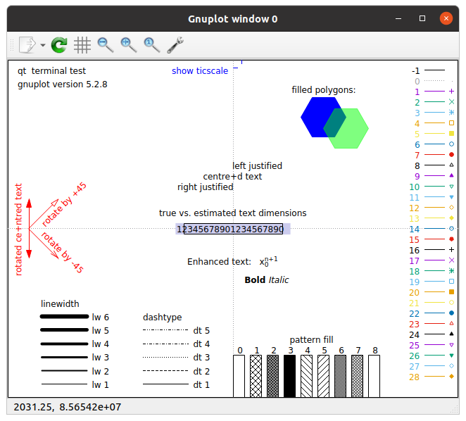
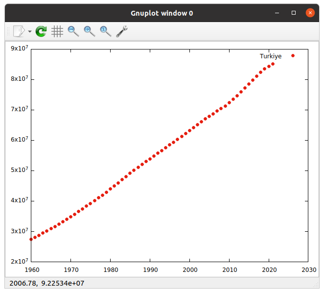
To change the point type, we can use linetype or lt and the number we choose.
gnuplot> p 'population.txt' us 1:2 t 'Turkiye' lt 7
Prints the output below.
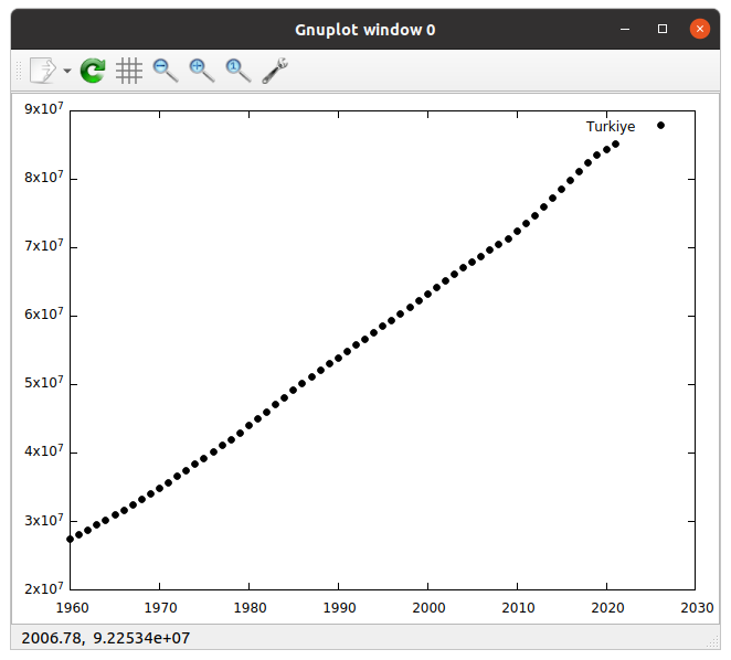
The color can be set to black by lc -1.
gnuplot> p 'population.txt' us 1:2 t 'Turkiye' lt 7 lc -1
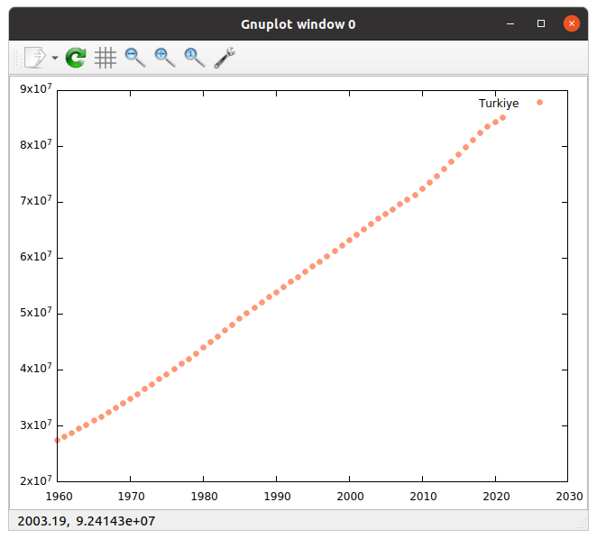
Sometimes we may need to use different colors than the default ones.
Then we can use RGB codes as lc rgb '#FF9876' for example.
gnuplot> p 'population.txt' us 1:2 t 'Turkiye' lt 7 lc rgb '#FF9876'
Please see this for more color codes.
Some color names can also be used in a similar format. Use lc rgb 'navy blue' for instance.
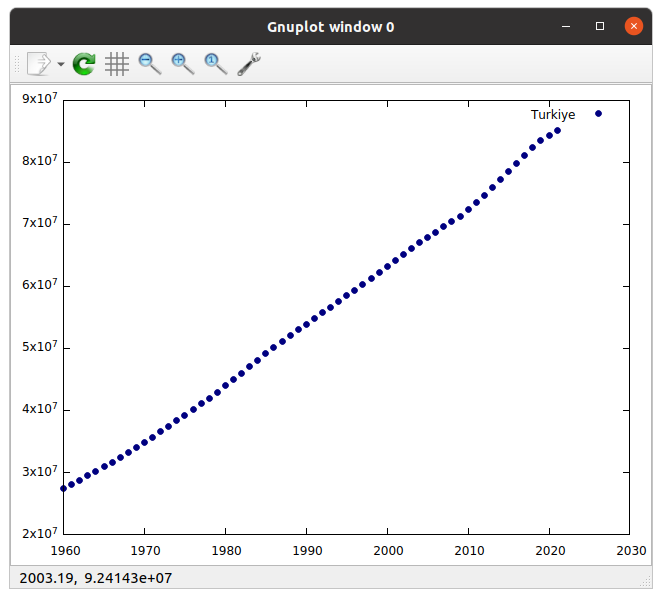
Lines
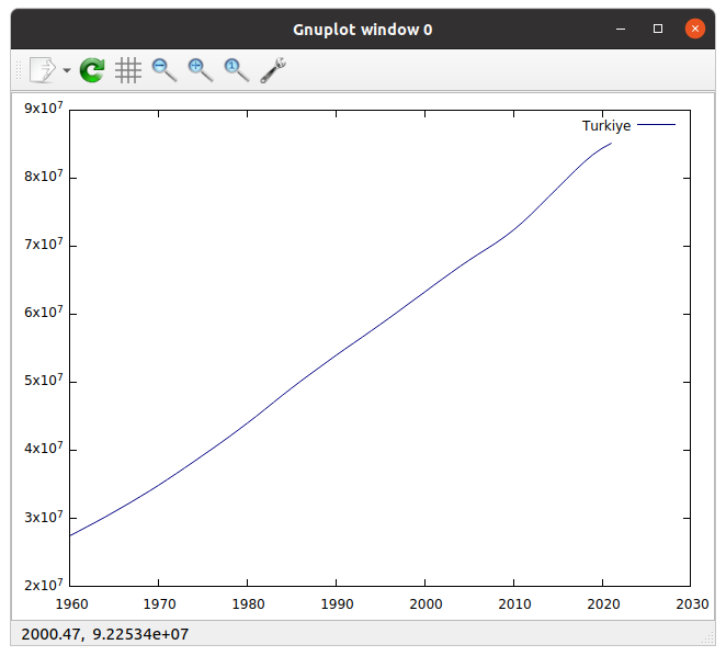
We can use lines using with lines or w l option.
gnuplot> p 'population.txt' us 1:2 t 'Turkiye' lt 7 lc rgb 'navy blue' w l
Or lines and points together using with linespoints or w lp option.
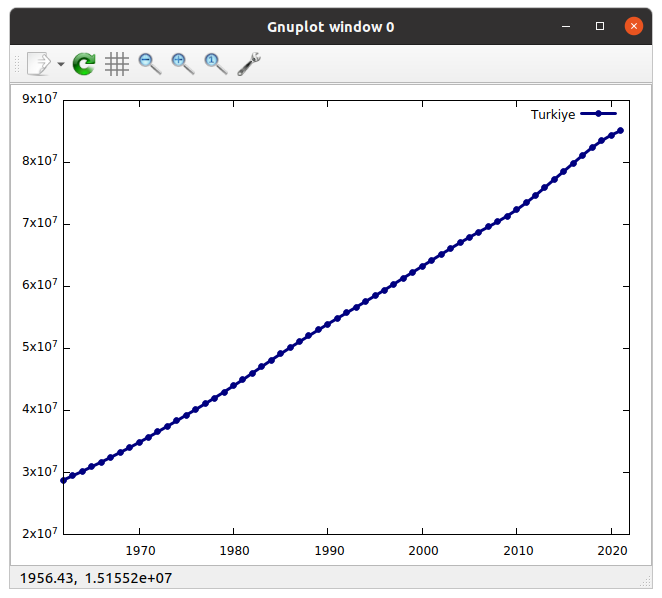
gnuplot> p 'population.txt' us 1:2 t 'Turkiye' lt 7 lc rgb 'navy blue' w lp

Line width is changed by linewidth or lw option. But it should be set before w lp.
gnuplot> p 'population.txt' us 1:2 t 'Turkiye' lt 7 lc rgb 'navy blue' lw 3 w lp
Set ranges of x and y axes
We can change the limits of the axes using
gnuplot> set xrange [1962:2022]
and
gnuplot> set yrange [20000000:90000000]
Then, you can just run replot to update the graph.
gnuplot> replot
Fix the x-axis tics
When we set the first year to 1962, the x tics seem weird. We can manually set them as follows:
gnuplot> set xtics (1962,1982,2002,2022)
We can use autofreq 1962,10 to set it starting from 1962 and increasing 10 by 10.
gnuplot> set xtics autofreq 1962,10
Or we can also limit earlier, such as:
gnuplot> set xtics autoreq 1962,10,1992
Set labels of axes
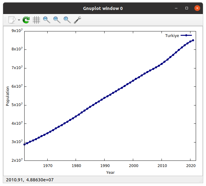
Similarly, we can use set xlabel 'Year' and set ylabelPopulation` for labels.
Math with data
The y-axis values of our graph are not easy to read for everyone.
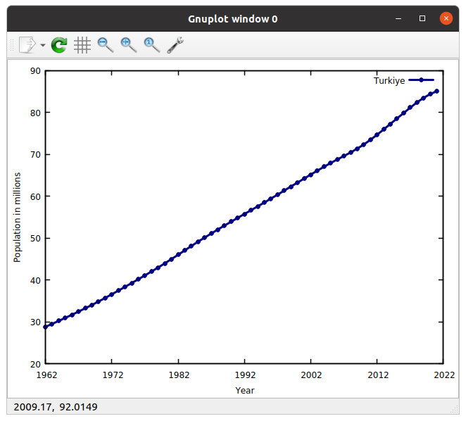
We can divide it to a million by using 1:($2 / 1000000) and express it on the label of y-axis as follows:
gnuplot> p 'population.txt' us 1:($2/1000000) t 'Turkiye' lt 7 lc rgb 'navy blue' lw 3 w lp
gnuplot> set ylabel 'Population in millions'
gnuplot> set yrange [20:90]
Borders
Change the border thickness using,
gnuplot> set border lw 1.5
Set grid
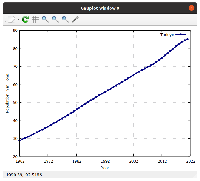
We can put grids on the graph with the command below.
gnuplot> set grid
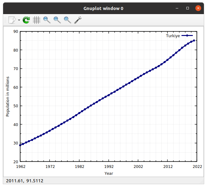
If you want to set the grids between the tics, you can use the commands below.
gnuplot> set grid xtics mxtics
gnuplot> set mxtics 5
gnuplot> set grid ytics mytics
gnuplot> set mytics 2
You can also change the grid type from dotted lines to other types.
gnuplot> set grid lt -1, lt 0
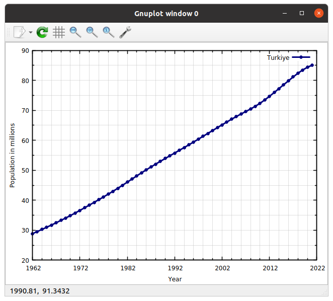
Or you can improve it by
set grid lw 1 lt -1 lc rgb 'gray', lw 1 lt 0 lc rgb 'gray'
Working on scripts
Until this point, we worked on Gnuplot using commandline. But all the setting will disappear when we press ctrl+d and exit.
So as to use the same settings on different plots, we can write Gnuplot scripts and use them as template for future works.
Press ctrl+d and open a file by vi template.gp.
Write the code below.
#/usr/bin/gnuplot

set xrange [1962:2022]
set yrange [20:90]
set xlabel 'Year'
set ylabel 'Population in millions'
set xtics autofreq 1962,10

set grid xtics lt -1 lw 0.2 lc rgb 'gray'

set grid xtics mxtics
set grid ytics mytics
set mytics 2
set mxtics 5
set grid lw 1 lt -1 lc rgb 'gray', lw 1 lt 0 lc rgb 'gray'

set border lw 1.5

plot 'population.txt' using 1:($2/1000000) t 'Turkiye' lt 7 lc rgb 'navy blue' lw 3 w lp
We can execute this script by,
gnuplot template.gp -p
Save graph to a file
To save the graph to a file, we first need to define a terminal, and we need to set output. Add the two lines below on the top of your script.
set terminal pdfcairo font 'Times,14' size 4.5in,3.0in
set output 'population.pdf'
Then, run your script. You should have a PDF document on the same directory at the end. You can open it by evince population.pdf.
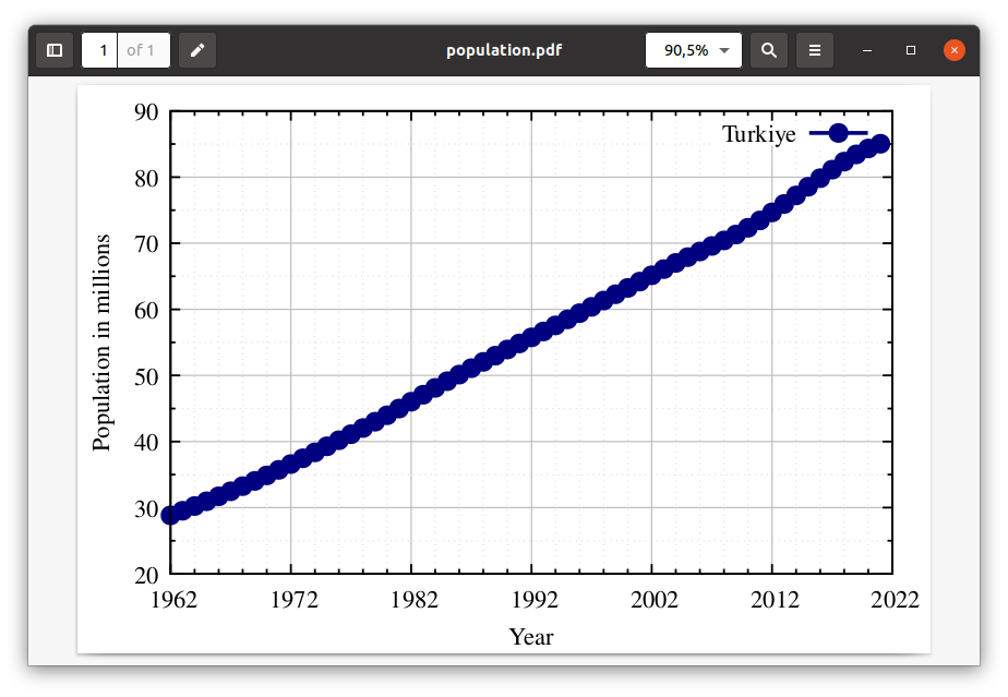
The default terminal in Gnuplot is qt or wxt depending on the version.
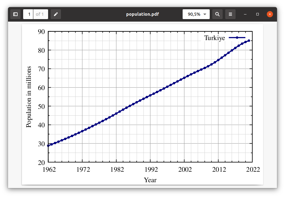
When we change the terminal the point sizes and some of other options we set on qt change.
To fix it, we can change the point size by adding ps 0.3 option in the line below.
plot 'population.txt' using 1:($2/1000000) t 'Turkiye' ps 0.3 lt 7 lc rgb 'navy blue' lw 3 w lp
And we can change the grid type by changing the line below.
set grid lw 1 lt -1 lc rgb 'dark-gray', lw 0.05 lt -1 lc rgb 'light-gray'
Adding multiple lines into the graph
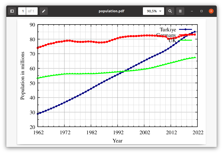
We can add multiple lines into the graph. To do that we can change the line as follows.
plot 'population.txt' using 1:($2/1000000) t 'Turkiye' ps 0.3 lt 7 lc rgb 'navy blue' lw 3 w lp ,\
'population.txt' using 1:($3/1000000) t 'Germany' ps 0.3 lt 4 lc rgb 'red' lw 3 w lp ,\
'population.txt' using 1:($4/1000000) t 'UK' ps 0.3 lt 8 lc rgb 'green' lw 3 w lp
Legend position
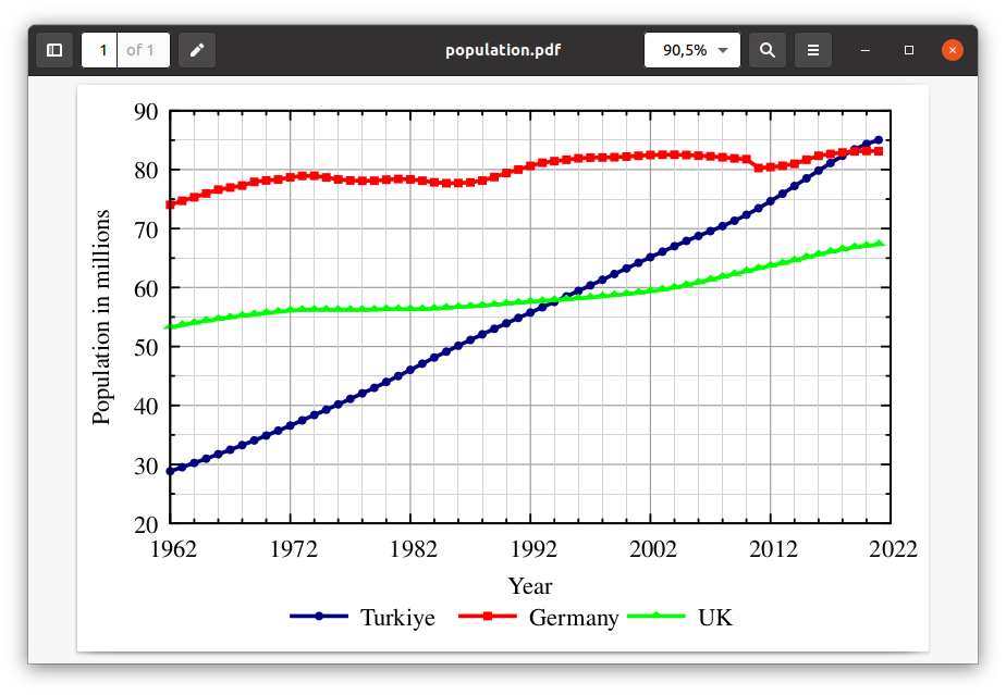
The legend position can be changed by set key right bottom for example. But I prefer locating the legend outside of the graph. Use following to do it.
set key reverse below Left spacing 2
Multiplots
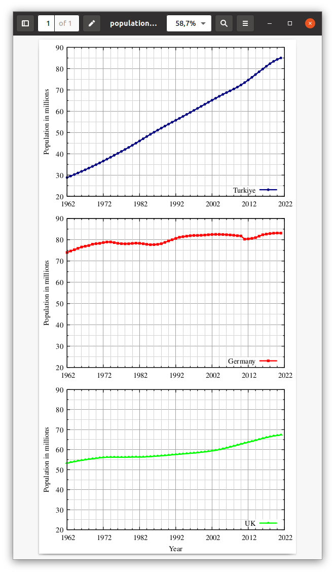
We can plot the different lines using multiplot method.
#/usr/bin/gnuplot
#set terminal pdfcairo font 'Times,14' size 4.5in,3.0in
set terminal pdfcairo font 'Times,14' size 4.5in,9.0in
set output 'population.pdf'

set xrange [1962:2022]
set yrange [20:90]
set xlabel 'Year'
set ylabel 'Population in millions'
set xtics autofreq 1962,10

set grid xtics lt -1 lw 0.2 lc rgb 'gray'

set grid xtics mxtics
set grid ytics mytics
set mytics 2
set mxtics 5
set grid lw 1 lt -1 lc rgb 'dark-gray', lw 0.05 lt -1 lc rgb 'light-gray'

set border lw 1.5

#set key reverse below Left spacing 2
set key bottom right

set multiplot layout 3,1

unset xlabel
plot 'population.txt' using 1:($2/1000000) t 'Turkiye' ps 0.3 lt 7 lc rgb 'navy blue' lw 3 w lp

unset xlabel
p 'population.txt' using 1:($3/1000000) t 'Germany' ps 0.3 lt 4 lc rgb 'red' lw 3 w lp

set xlabel 'Year'
p 'population.txt' using 1:($4/1000000) t 'UK' ps 0.3 lt 8 lc rgb 'green' lw 3 w lp

unset multiplot
Then the output will be as follows:
Animated GIFs
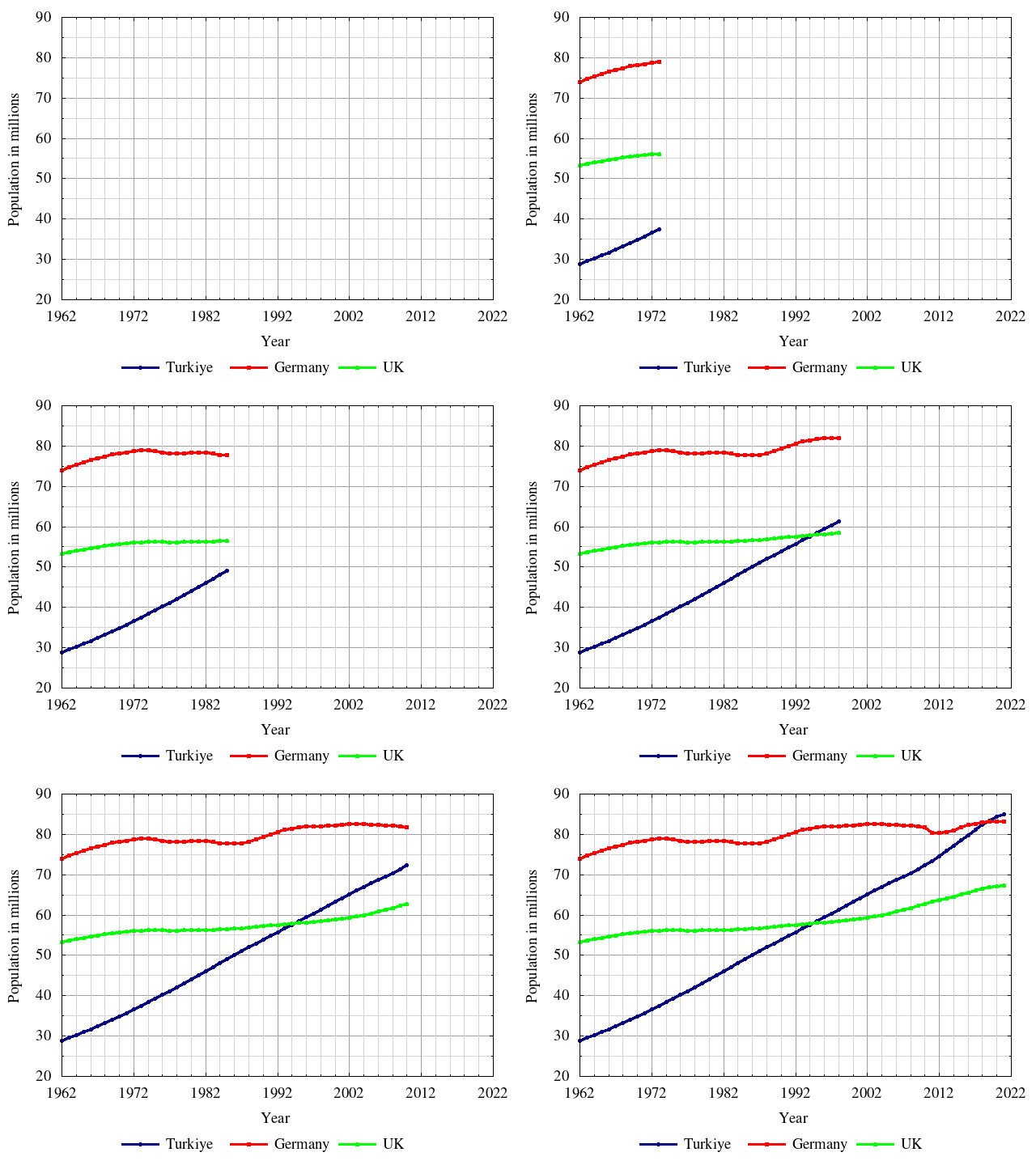
We can animate the graphs using Gnuplot. To do it we need to change the terminal and use a for loop as shown below.
#/usr/bin/gnuplot
set terminal gif animate delay 1 font 'Times,14'
set output 'population.gif'

set xrange [1962:2022]
set yrange [20:90]
set xlabel 'Year'
set ylabel 'Population in millions'
set xtics autofreq 1962,10

set grid xtics lt -1 lw 0.2 lc rgb 'gray'

set grid xtics mxtics
set grid ytics mytics
set mytics 2
set mxtics 5
set grid lw 1 lt -1 lc rgb 'dark-gray', lw 0.05 lt -1 lc rgb 'light-gray'

set border lw 1.5

set key reverse below Left spacing 2

do for [i=1:62]{
plot 'population.txt' using 1:($2/1000000) every ::1::i t 'Turkiye' ps 0.3 lt 7 lc rgb 'navy blue' lw 3 w lp ,\
'population.txt' using 1:($3/1000000) every ::1::i t 'Germany' ps 0.3 lt 4 lc rgb 'red' lw 3 w lp ,\
'population.txt' using 1:($4/1000000) every ::1::i t 'UK' ps 0.3 lt 8 lc rgb 'green' lw 3 w lp
}
Then the output can be watched by google-chrome population.gif as follows.
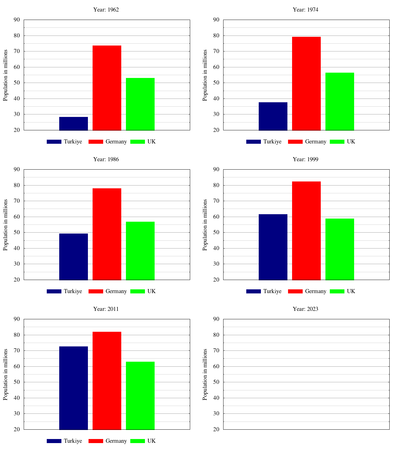
This animation can be done converting the line graph to bar graph as follows:
#/usr/bin/gnuplot
set terminal gif animate delay 1 font 'Times,14'
set output 'population.gif'

set xrange [1962:2022]
set yrange [20:90]
set xlabel 'Year'
set ylabel 'Population in millions'
set xtics autofreq 1962,10

set grid xtics lt -1 lw 0.2 lc rgb 'gray'

set grid xtics mxtics
set grid ytics mytics
set mytics 2
set mxtics 5
set grid lw 1 lt -1 lc rgb 'dark-gray', lw 0.05 lt -1 lc rgb 'light-gray'

set border lw 1.5

set key reverse below Left spacing 2

set boxwidth 10
set style fill solid
unset xtics
unset xlabel

do for [i=1:62]{
x=i+1961
set title 'Year: '.x
plot 'population.txt' using (1980):($2/1000000) every ::i::i t 'Turkiye' ps 0.3 lt 7 lc rgb 'navy blue' lw 3 w boxes ,\
'population.txt' using (1992):($3/1000000) every ::i::i t 'Germany' ps 0.3 lt 4 lc rgb 'red' lw 3 w boxes ,\
'population.txt' using (2004):($4/1000000) every ::i::i t 'UK' ps 0.3 lt 8 lc rgb 'green' lw 3 w boxes
}
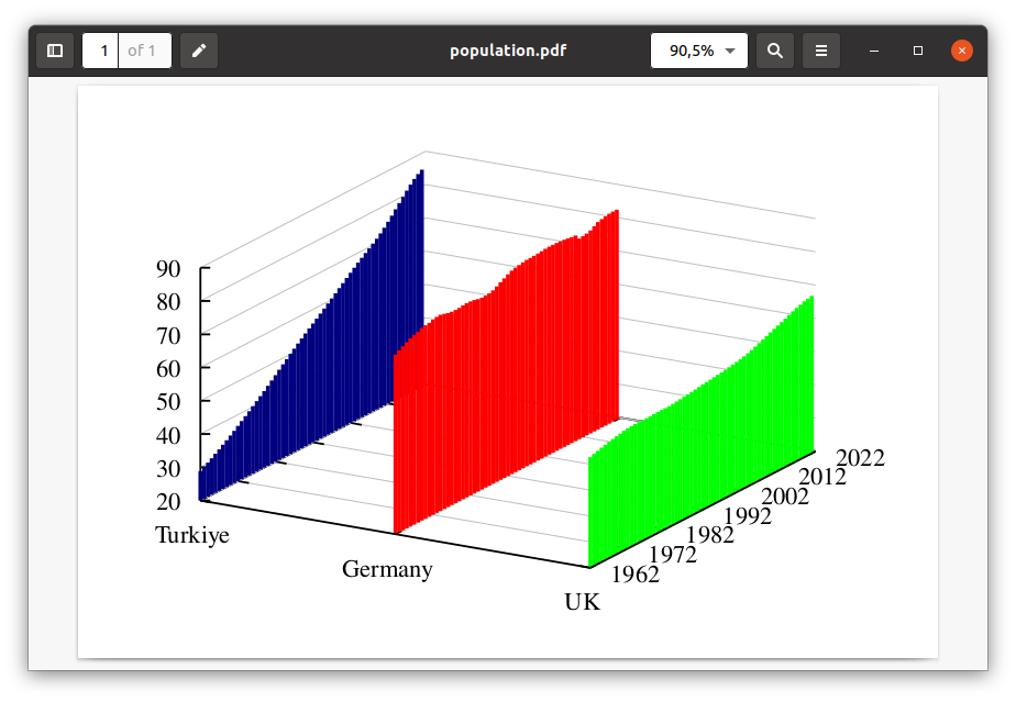
3D plots
#/usr/bin/gnuplot
set terminal pdf font 'Times,14' size 4.5in,3in
set output 'population.pdf'

set xyplane 0
set yrange [1962:2022]
set zrange [20:90]
set xrange [1:3]
set ytics autofreq 1962,10

set grid ytics lt -1 lw 0.2 lc rgb 'gray'
set grid xtics lt -1 lw 0.2 lc rgb 'gray'
set grid ztics lt -1 lw 0.2 lc rgb 'gray'

set border lw 1.5

set xtics ("Turkiye" 1, "Germany" 2, "UK" 3) offset 0,-1

unset key

splot 'population.txt' using (1):1:($2/1000000) t 'Turkiye' ps 0.3 lt 7 lc rgb 'navy blue' lw 3 w boxes ,\
'population.txt' using (2):1:($3/1000000) t 'Germany' ps 0.3 lt 4 lc rgb 'red' lw 3 w boxes ,\
'population.txt' using (3):1:($4/1000000) t 'UK' ps 0.3 lt 8 lc rgb 'green' lw 3 w boxes
